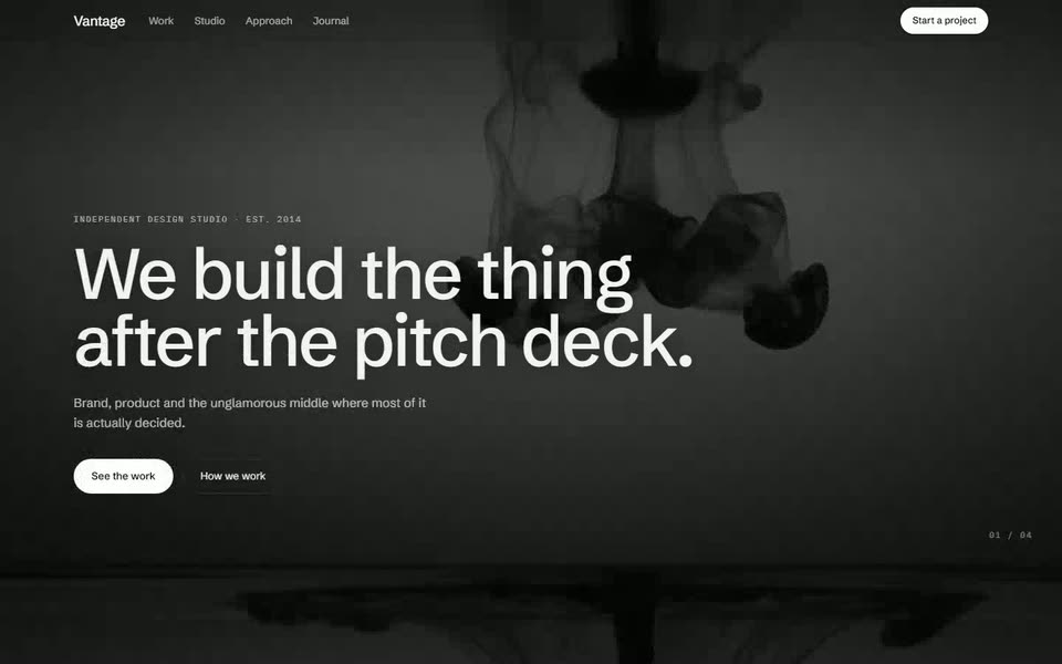
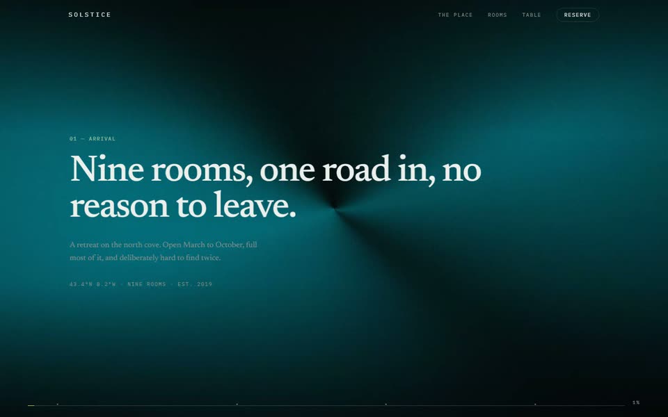
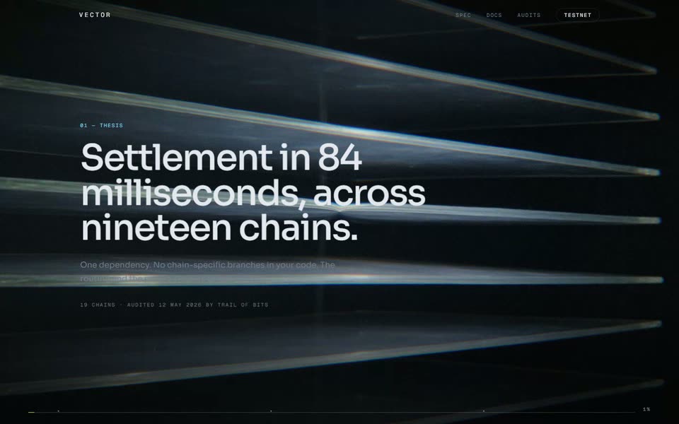
Ember — Restaurant Landing Page
A restaurant page that behaves like a room rather than a menu: film scrubbed by scroll, a service list that fills as you pass it, and a booking block that tells you what is actually available tonight.
The prompt — 4 sections
Film Foundation
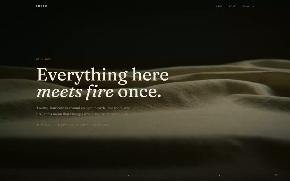
Build a landing page for **Ember**, a twenty-four cover restaurant. The page should feel like the room at seven o'clock, not like a menu PDF.
- **Stack:** React + Tailwind, film on a WebGL quad, warm grade.
- **Palette:** page `#0B0907`, ink `#F2EDE4`, muted `#93887A`, hairline `rgba(242,237,228,0.12)`, accent `#E2703A` — an ember orange used only for rules, the scrubber and one button.
- **Type:** a serif with real italics for display, a mono at 11px uppercase 0.16em for labels. Body at 16px/1.75 — a restaurant page is read slowly.
The rule: **no stock food photography.** The footage is the room, the light and the surfaces. Plated food shot badly is worse than no food at all, and every restaurant site already has it.
Three viewports of track. This is a short page; a restaurant that makes you scroll for eight screens has lost the booking.
Chapters
Three acts over the film.
1. **Room** (0.00–0.30) — the name in display italic, one line on what it is, and a mono line with covers, nights open and the year it opened.
2. **Fire** (0.36–0.66) — two short paragraphs on the cooking. Name the fuel and the temperature; specifics are what separate this from every other wood-fire paragraph ever written.
3. **Service** (0.72–1.00) — how an evening runs, as four timed lines: doors, first seating, the pass closing, last orders. Mono times, prose descriptions.
Drift −80px, zoom 4%. Scrubber pinned to the bottom with a tick per chapter.
The List
Below the film, the menu — as a list that fills rather than a grid of cards.
Nine dishes. Each row: a dish name in the serif at 22px, a one-line description in muted text, and a price in mono, right-aligned and tabular. A hairline rule beneath each.
As each row enters the viewport, animate a fill sweeping left to right beneath the text at 8% accent, staggered 60ms per row. It should read as the row being served, not as a loading bar — so ease it out, and never repeat it once played.
Do not mark dishes with allergen icons. Put one line at the foot of the list saying to tell the floor and that the kitchen will work around it, which is both more honest and more useful than a row of symbols.
Booking & Close
A booking block that states availability instead of pretending everything is open.
Show tonight and the next six nights as a row of chips: the weekday in mono, the date, and a state — a count of covers left, or "Full", or "Closed". Full and closed chips are not clickable and say so; a booking widget that lets you select an unavailable night and then fails is the worst pattern in hospitality.
Selecting an available night reveals two time slots. One solid accent button confirms.
Close on a full-bleed still — the film's poster frame — with the address, the phone number as a real `tel:` link, and one line covering what people write in to ask: no set menu on weekdays, walk-ins at the counter, kitchen closes at ten.
Footer: wordmark, address, opening nights, and a mono copyright line.